Mallory Mobley
March 30th, 2017
Technical Writing
Word Count: 464
Many people are not aware of exactly how many families receive federal welfare. This topic interests me because just recently I was working in a children medical office and was pulling charts for the head nurse on duty that day. Every chart that I pulled had some type of federal welfare on it for their healthcare and it shocked me that so many people were getting this type of assistance. This chart was released by the Republican side of the Senate Budget Committee. The source of this chart was the U.S. Census’ Survey of Income and Program Participation.
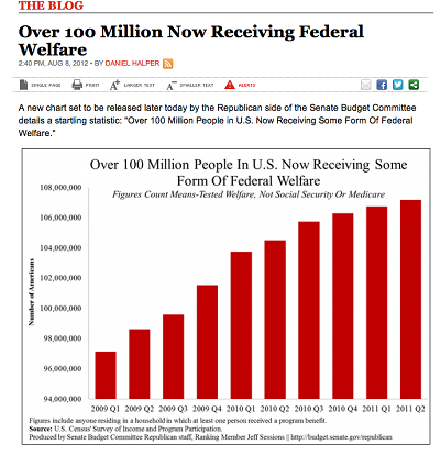
This graph was created to show people all across the United States just how many families receive federal welfare. This is a very simple graph that shows the number of American on tested welfare, not Social Security or Medicare. After reading Chapter 18 in our textbook, I feel like this graph is lacking some important organization and information that will help it become a better graph.
There are several guidelines you should follow when creating any type of graph or chart. For this particular chart, I feel like they are lacking on the third and fourth guideline that is discussed in our book. Guideline three states that “A Graph Should Ethical” and guideline four says “A Graphic Should Be Labeled and Placed Properly”. This graph is not ethical because it is being used to distort the facts and exaggerate the welfare trend. You can tell because the graph starts with 94,000,000 and not 0. A good rule of thumb with graphics and charts is to always be absolutely honest. Once distorted information is detected, unethical graphs can erode the credibility of an entire document or presentation. This graph also lacks the proper labeling. The x-axis of the graph is not labeled and the y-axis of it does not display standard units of measurement. The strengths of this graph include a well-developed title and accurate data from a reliable source. However, the creator of this graph needs to make sure that the reliable data is displayed correctly.
Overall, this graph has valuable information and has potential to become a more accurate and professional chart. I do believe that some changes need to be made. If they took my suggestions and revised the graph it would be better than ever. I think it would be well-developed and appear more reliable to the viewers.
Works Cited
Andale. "Misleading Graphs: Real Life Examples." Statistics How To. N.p., 24 Jan. 2014. Web. 30 Mar. 2017. <http://www.statisticshowto.com/misleading-graphs/>.
No comments:
Post a Comment